A closer look at why some outfits work better than others — and how colour quietly shapes the difference.
There is a particular kind of frustration that happens when an outfit should work, yet somehow doesn’t. You stand in front of the mirror wearing pieces you trust—the cashmere jumper that felt like a sensible indulgence, the trousers that fit as though they were made for you, the bag that has travelled with you through several phases of life—and still the result feels slightly off.
Nothing is technically wrong. The pieces are good. But the result isn’t magic.
By a certain point in life, we no longer have time for merely “not bad.” We know the silhouettes that flatter us, the fabrics worth investing in, and the pieces that make us feel like ourselves. Our wardrobes should reflect that hard-won clarity. When they don’t, it often leads us back to the same lingering question: why do some outfits work beautifully, while others just refuse to come together?
It’s easy to assume the answer lies in structure. We wonder if the proportions are slightly off, if the jacket is too cropped for the trouser rise, or if the shoulder line is subtly undermining the whole look. These explanations feel logical because cut and silhouette are the most visible parts of clothing.
But the longer you pay attention to what actually makes an outfit succeed, the more another explanation begins to surface. Colour is the quiet architect of an outfit. It shapes how every single element is perceived, yet it rarely announces itself when something goes wrong. We notice immediately when a seam puckers or a hem drags, but we rarely stop to consider whether the colours themselves are fighting a quiet war.
Once you truly see how colour operates on a living, moving human body, you will never unsee it.
Why Some Colours Clash Even When They Match
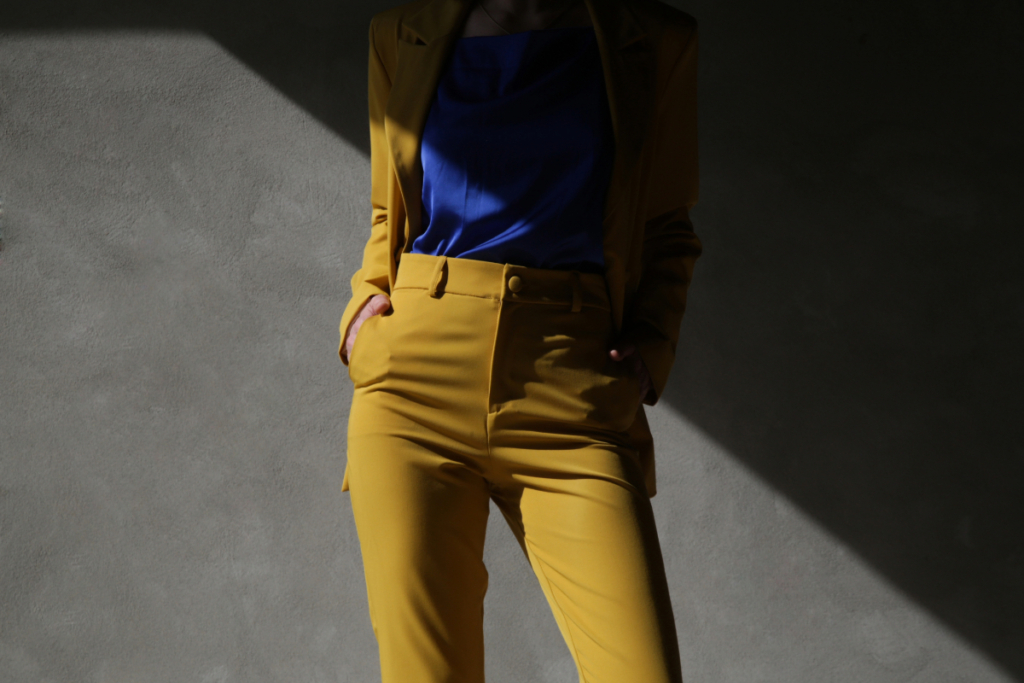
One of the most overlooked aspects of colour is temperature. Most of us learned the basics early on—blue is cool, red is warm, yellow is warm. That knowledge is usually enough to prevent obvious disasters, but it hides a more interesting truth: every single colour exists in both warm and cool versions.
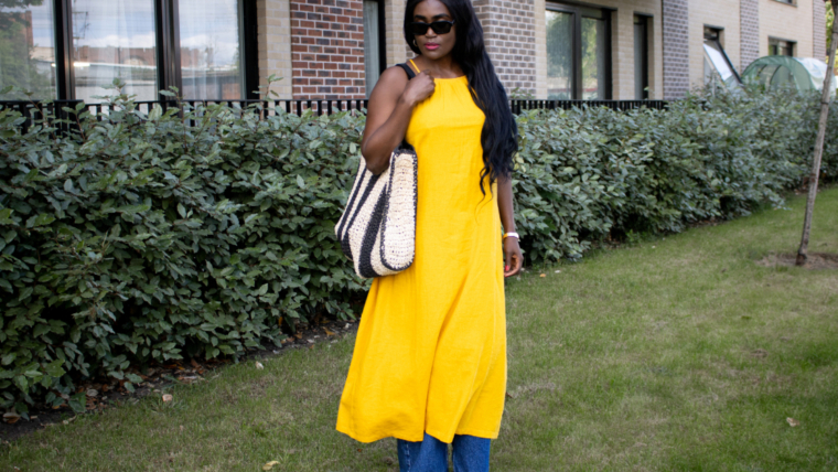
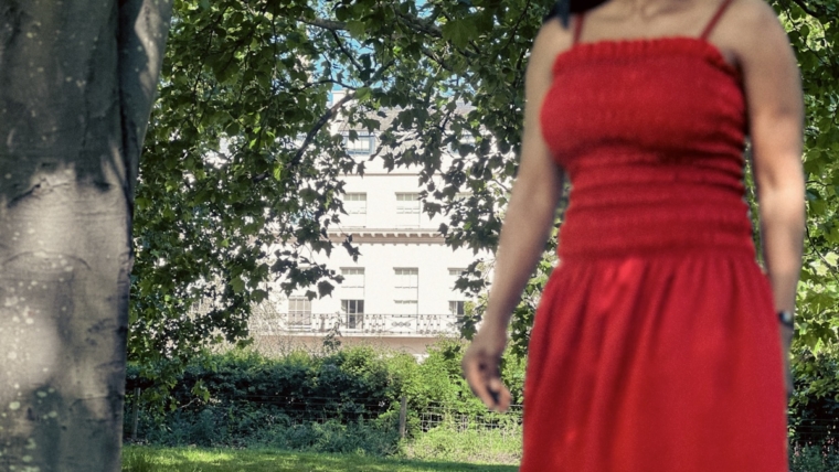
Take red, for instance. A tomato red leans warmly towards orange, almost edible in its richness. A raspberry red leans cool, almost blue. Both are clearly red, yet their undertones place them in entirely different visual families.
Why does this matter so much? Because of how the human eye processes depth. Warm colours optically advance toward the viewer, while cool colours visually recede. When you pair a cool-toned silk blouse with warm-toned wool trousers, it might look perfectly reasonable on paper, but the eye senses a subtle, optical friction. The top is pulling away while the trousers are pushing forward. The outfit simply feels unsettled because the eye cannot establish a visual balance.
Once you learn to spot temperature, you stop buying pieces that will never play well with others, and you start building a wardrobe that actually functions as a system—one where everything exists in harmonious optical agreement.
Read More: Why Copying Other People’s Outfits is the Smartest Fashion Move You Can Make
The Mistake That Makes Outfits Look Flat
If temperature dictates harmony, value is the invisible foundation of dimension. Value refers to how light or dark a colour is, and misunderstanding it explains why many outfits feel visually flat even when the individual pieces are beautiful.

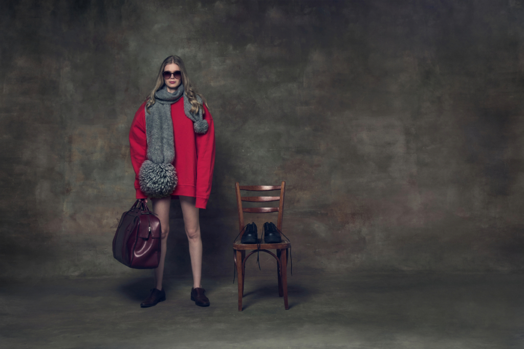
Most of us instinctively dress within a narrow value range. Medium blue denim, a mid-grey knit, a camel coat, brown shoes. It feels safe, but there is a distinct visual consequence: the human eye relies on highlights and shadows to understand three-dimensional shapes. When an outfit stays entirely within that middle range, the eye has nowhere to travel. The body becomes a two-dimensional block. The look becomes visually static, which is exactly why low-contrast outfits can look utterly dead in pictures.
The outfits that quietly hold attention almost always introduce value contrast. A dark coat against pale trousers immediately creates depth, mimicking the way light and shadow naturally fall. Women who intuitively know how to make outfits look more expensive with colour might wear ivory paired with chocolate brown, or head-to-toe black while making sure to introduce value contrast through texture—letting glossy leather catch the light while matte wool absorbs it, doing the work that colour cannot.
Why Your Palette Must Evolve
This is where things get deeply personal. Saturation refers to the intensity or sheer volume of a colour. Highly saturated colours appear vivid and loud (think electric pink), while lower saturation colours feel softer and muted (think dusty rose).
Many women notice that their relationship with colour evolves gradually in their forties and fifties. Colours that once felt striking and effortless can begin to feel slightly overpowering, almost like a costume. This isn’t because society has deemed you “too old” for bright colours. It is a matter of biology.
As we age, we naturally lose some of the intensity of melanin and haemoglobin in our features. Our skin’s undertone and translucency evolve over time, hair softens, and the sharp contrast between our eyes, lips, and skin begins to lower. The complexion that once provided enough visual strength to anchor a highly saturated dress now receives that colour differently. When you wear a high-saturation colour against a lower-contrast face, the clothes enter the room before the woman does.
Learning to adjust saturation as you age is not about dulling your palette or retreating into beige. It is about refining it to match your current natural contrast. A vivid red becomes a deeper brick tone; a bright pink softens into rose. The colour remains present, but the balance is restored, allowing you to wear the outfit, rather than the outfit wearing you.
The Secret to Instant Harmony
There is one final dimension of colour that helps explain why certain outfits feel instinctively harmonious: chroma, which refers to the clarity or purity of a colour.
Two colours may have similar intensity, yet one appears crisp and luminous (like a clear jewel-toned emerald) while the other looks slightly muted (like a dusty olive green). When colours with very different chroma levels are combined, the outfit can feel faintly discordant.
Why? Because mixing a clear, high-chroma colour with a muted, low-chroma colour creates an unfortunate optical illusion. The clear colour suddenly looks glaring or inexpensive, while the muted colour suddenly looks muddy, dirty, or worn out. They don’t belong to the same visual world.
The most elegant dressers tend to maintain consistent chroma levels across their palette. Their colours may vary widely, but their clarity feels aligned. This consistency is the foundation of colour combinations that always work. It is why a wardrobe of all muted, earthy tones looks impossibly chic, just as a wardrobe of all clear, crisp jewel tones does.
Read More: 6 Fashion Basics To Live By This Spring
How to Find Your Colours: A Simple Exercise
Instead of focusing only on the garments themselves, look at your existing wardrobe with entirely new, diagnostic questions.
- Pull out five outfits that absolutely work. The ones that generate compliments even when you throw them on in a hurry. Spread them out.
- Analyse the patterns. Do the colours lean warm or cool (temperature)? Is there a clear journey from light to dark (value)? Do the shades feel vivid or quiet (saturation)? Do they share a similar clarity or muddiness (chroma)?
- Now, pull out five outfits that almost work. The ones you want to love but don’t quite. Ask yourself those same questions.
The differences will reveal themselves immediately. You will understand instantly why a cool-toned blouse cannot simply be added to a warm-toned wardrobe and expected to behave.
Gradually, getting dressed feels less like guesswork and more like understanding. Because the most compelling outfits are rarely accidental. They are the alchemy of proportion, fabric, mood, and colour, finally aligning—creating that satisfying sense that everything simply works.